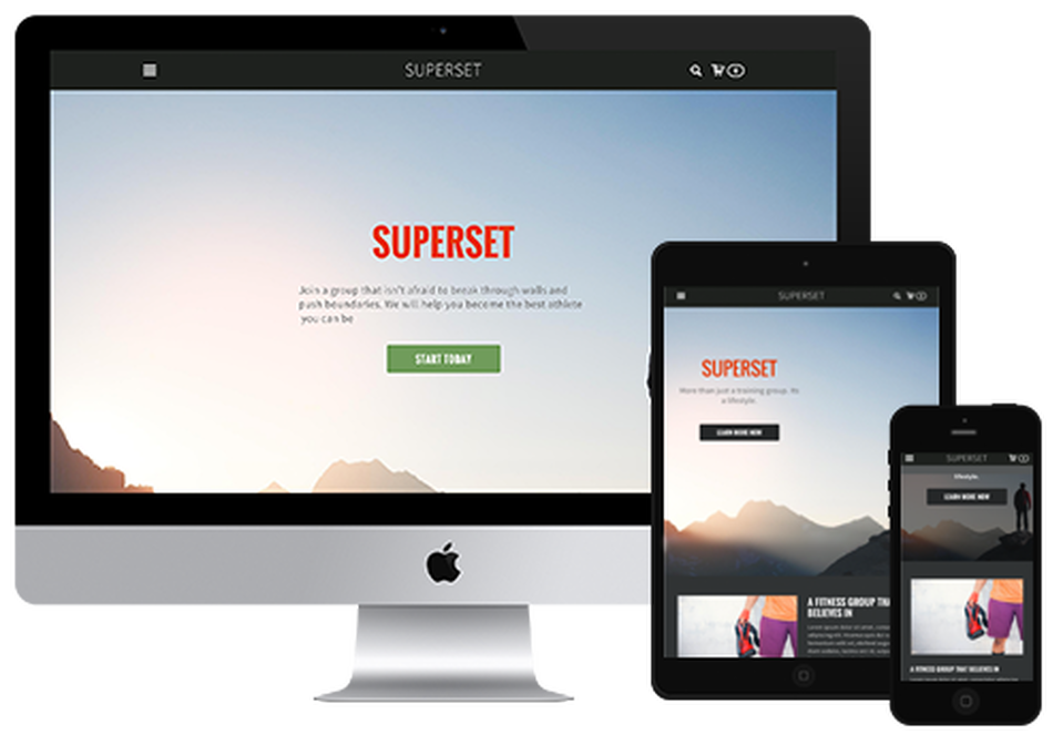
Balancing mobile and desktop needs is vital. While an increasing number of website visitors are using mobile devices including tablets and smartphones, many prefer to visit websites using desktop and notebook computers. This means websites should work for everyone and automatically adapt to the display of whatever device and browser is used.
With a PlanStartGrow website redesign, your website can work across different devices and browsers as your visitors expect. Responsive website themes (templates) automatically detect screen sizes, browser types, and other factors and then display an optimized view of your website. All of this happens automatically so you won't have to worry about how your website updates will appear on desktop and mobile devices.
With a PlanStartGrow website redesign, your website can work across different devices and browsers as your visitors expect. Responsive website themes (templates) automatically detect screen sizes, browser types, and other factors and then display an optimized view of your website. All of this happens automatically so you won't have to worry about how your website updates will appear on desktop and mobile devices.

